There’s something about a tree full of handmade ornaments that feels more personal than a box of store-bought balls. This year, skip the crowded aisles and make your own with 20 DIY ornament ideas that range from vintage paper rosettes to modern clay and tin designs.
Each project brings a unique look to your holiday decor without requiring a craft room full of supplies. You’ll find options for every skill level, from simple salt dough shapes to more detailed fabric and paper constructions, all meant to add character and warmth to your tree.
1. Vintage Honeycomb Paper Ornaments for a Nostalgic Feel
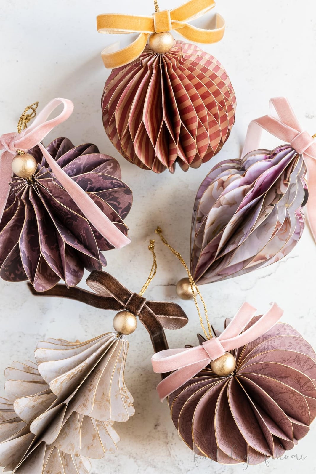
Five honeycomb paper ornaments in burgundy, pink, purple, beige, and gold bring back the look of old-fashioned Christmas crafts. The paper folding creates an intricate texture that catches soft overhead light, while velvet ribbon and metallic beads add a refined finish. This style works best when the palette stays in a warm, muted range rather than going bright. The mix of matte paper and shiny beads keeps the ornament from feeling flat.
2. Antique-Inspired Ornaments with Raised Gold Detailing
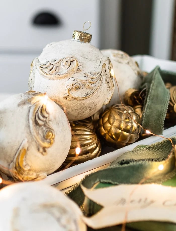
These ornate ornaments read as antique. The off-white plaster base gives the gold leaf a place to stand out, and the green velvet ribbon ties the look to traditional holiday colors. Grouped in a tray with warm fairy lights, the metal and glass accents catch the glow. The ratio of gold to off-white stays about one part metallic to three parts matte, which keeps the ornament from feeling gaudy. What breaks the style is adding too many shiny finishes at once.
3. Rustic Tin Mold Ornaments with Festive Greenery
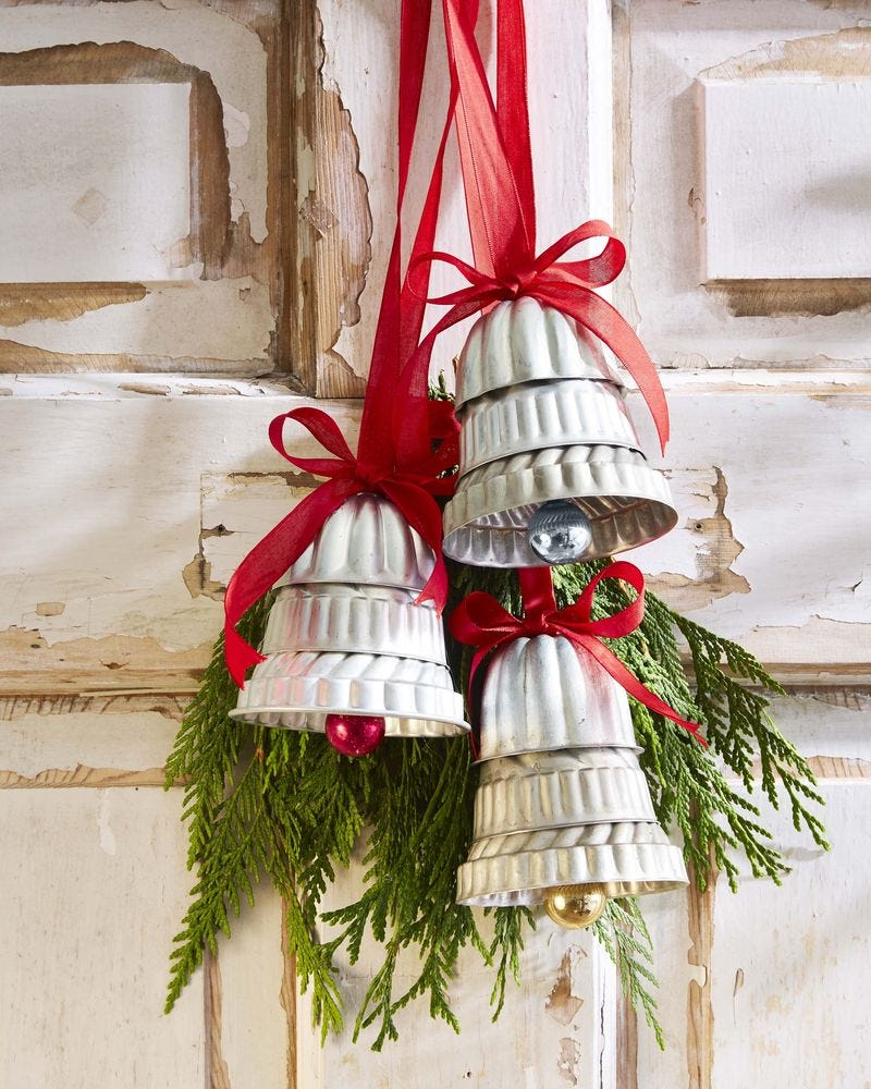
Can you turn vintage tin molds into tree decorations without a lot of effort? Stacked in a hanging display, these silver tin forms read as bells, with red ribbon and fresh greenery adding the festive color. The soft directional light brings out the metallic sheen on the tin surfaces.
The rustic style holds together because the materials stay natural: tin, ribbon, and greenery. The red and green palette breaks the silver monotony, but the ratio keeps the greenery as the accent rather than the main event. If the ribbon were satin instead of matte, the whole look would shift toward formal.
4. Natural Salt Dough Ornaments with Rustic Embellishments
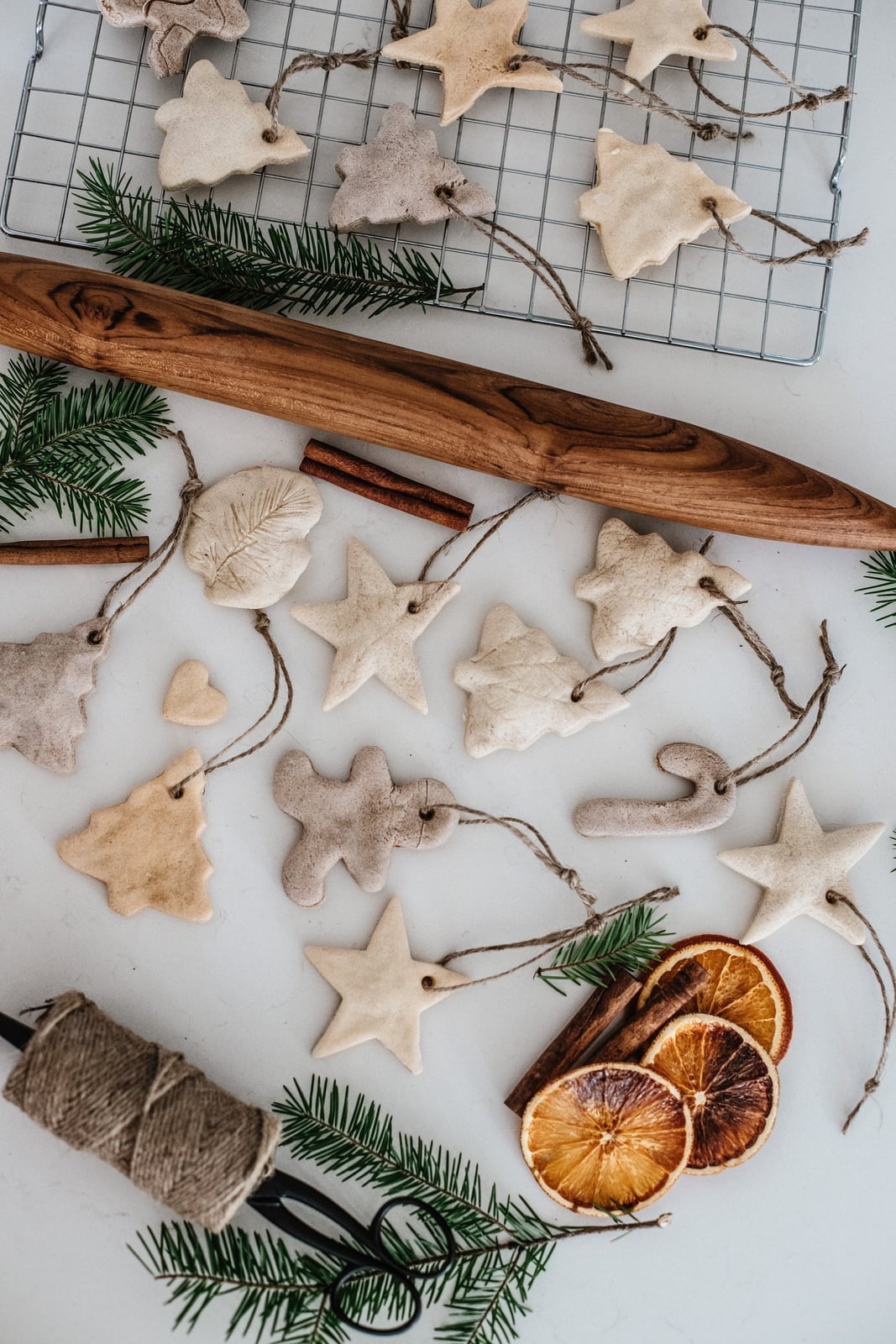
Salt dough ornaments take on imprinted textures that give each piece a handmade feel. The beige and cream dough pairs with twine, wood, dried orange, and cinnamon in a palette that stays within earthy tones. Soft natural light keeps the brown and green accents from looking harsh. This natural palette works because the ratio of neutral to accent is roughly three to one, so the cinnamon and orange stay as details without overwhelming the ornaments.
5. Vintage Paper Rosette Ornaments with Postcard Imagery
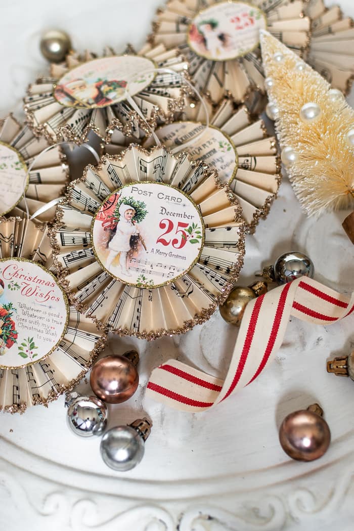
A practical rule for paper rosette ornaments: store them flat in a box with acid-free tissue between layers so the pleats don’t crush. These cream and gold rosettes use vintage postcard images as the centerpiece, with red ribbon and glitter accents around the edges. The soft warm light in the scattered arrangement keeps the paper from looking brittle. The ratio of image to pleated paper is about one to two, which gives the rosette a focal point without overwhelming the folded texture. Glitter on the ribbon edges breaks the matte paper finish just enough to catch light.
6. Modern Rustic Clay Ornaments with Embroidered Details
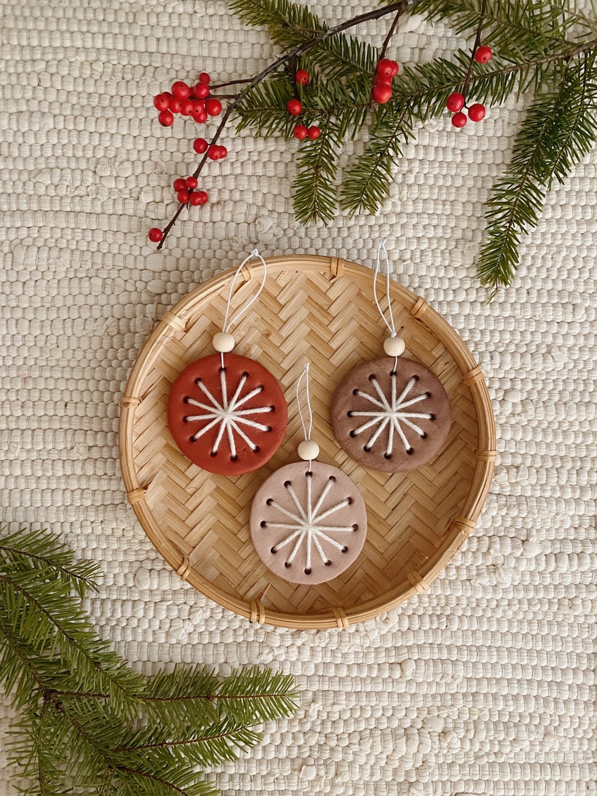
Store-bought ceramic ornaments can feel a little stiff for a modern rustic look. Clay ornaments with embroidered details offer a softer, more tactile alternative. The three round pieces here sit in a woven basket on a linen cloth, their terracotta and beige tones grounded by brown and white accents. The embroidered details add texture without making the design fussy. The style hinges on material contrast: smooth clay against stitched thread, natural fiber against painted surface. What breaks it is adding too many shiny or synthetic elements. Keep the display simple, and the ornaments become the quiet focal point they were meant to be.
7. Minimalist Clay Ornaments with Painted Pine Branches
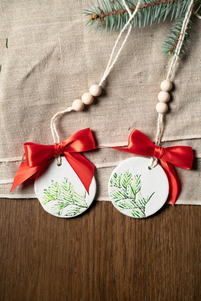
The painted pine branches on these clay ornaments use just enough green and red to be festive without crowding the white surface. Two round ornaments rest on a textured fabric, their wood bead accents repeating the natural palette. The ratio of white to color is roughly three to one, which keeps the look airy. Adding more pattern or a second motif disrupts the balance. For renters who want holiday decor that does not fight a neutral wall or white trim, this is a solid starting point.
8. Festive Salt Dough Ornaments with Embossed Patterns
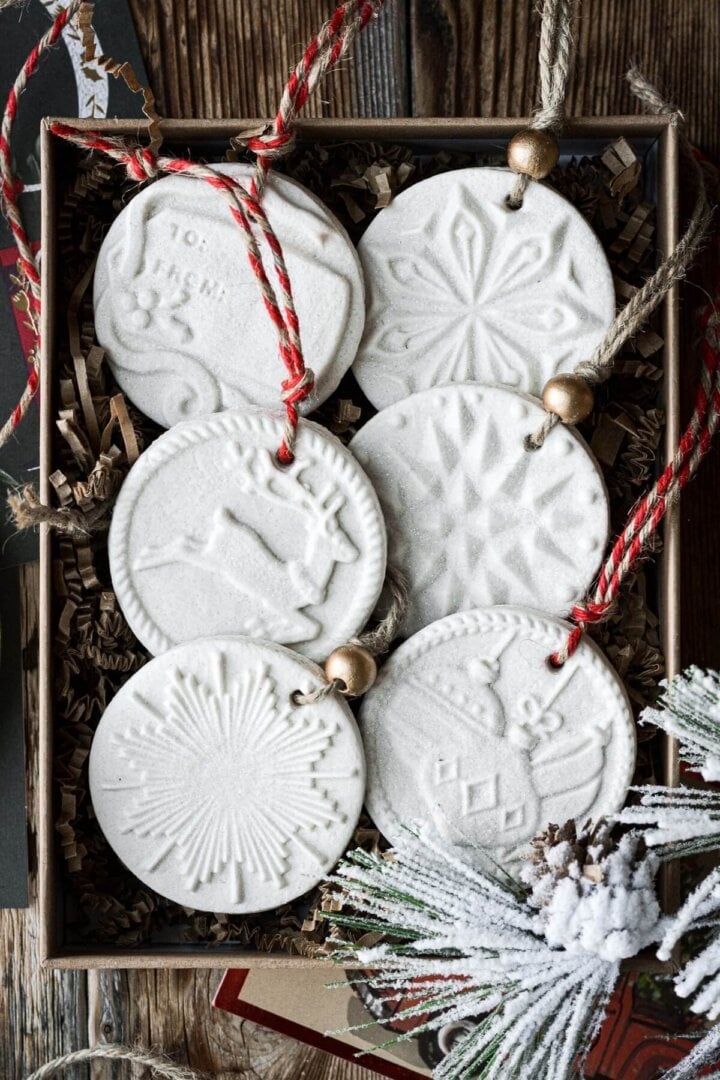
Salt dough ornaments with embossed patterns deliver a lot of visual interest for very little effort. The stamped discs here use a classic Christmas palette of white, red, and gold, with simple twine loops for hanging. Arranged in a box under natural daylight, the embossed texture catches shadows that make the patterns pop. The material itself is the star: salt dough is cheap, easy to shape, and takes stamping well. What breaks the look is overcrowding the surface with too many stamps or colors. One clear motif per ornament keeps the collection cohesive.
9. Rustic Farmhouse Tin Ornaments with Black Patterns
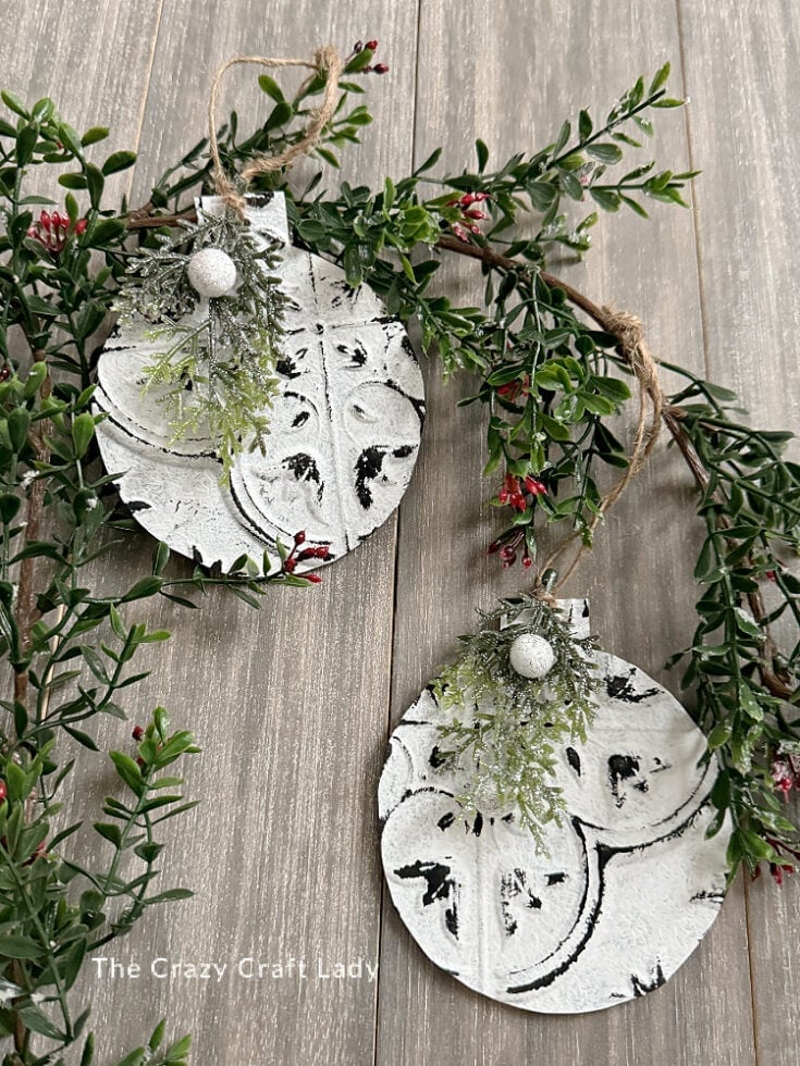
Can tin ornaments hold up year after year without looking battered? These distressed tin pieces with black patterns suggest yes. Hung in a display with greenery, their white and black palette reads clean and graphic. The distressed finish is the key: it hides minor scuffs and gives each ornament a slightly worn character that fits a farmhouse style. The palette works because it is limited to three tones: white, black, and the green of the foliage. Adding a fourth color that competes with the black pattern disrupts the look. Group them in odd numbers for a balanced hanging display.
10. Elegant Chinoiserie Ornaments for a Classic Look
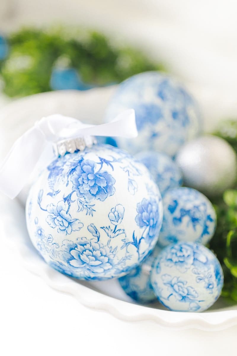
Blue and white chinoiserie patterns on glass or paper decoupage ornaments bring a classic, collected look to a holiday tree. The grouped display here pairs them with greenery, letting the blue stand out against a soft natural light. The proportion of pattern to negative space matters: chinoiserie motifs look best when they cover about half the ornament surface. Avoid mixing in ornaments with bright modern colors. Stick to the blue and white palette for a cohesive arrangement.
11. Whimsical Paper Honeycomb Ornaments in Vibrant Hues
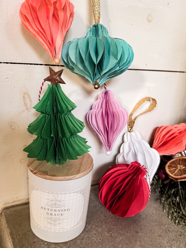
A palette this playful does the work for you. Coral, teal, pink, red, and white turn paper honeycomb ornaments into the focal point of any display, whether they hang on a tree or sit beside a candle. The whimsical style comes from the contrast: soft ambient light keeps the paper from feeling flat, while the mix of warm and cool tones keeps the eye moving. What breaks the look is too much matching. Let the ornaments lead and keep everything else neutral, so the color ratio stays three parts bright to one part quiet.
12. Abstract Marbled Ornaments with Silver Garland Accents
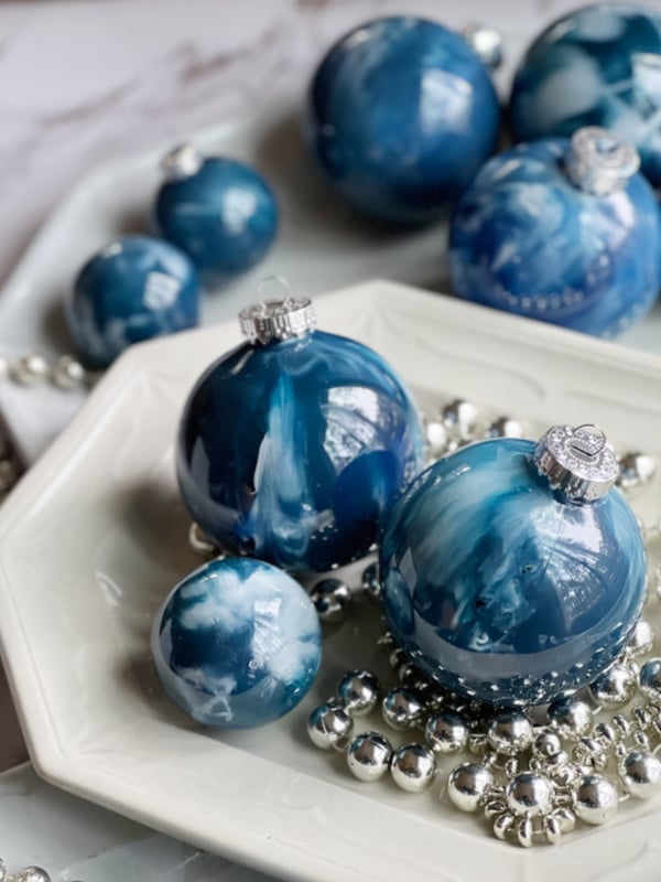
Marbled ornaments often lean toward traditional blues and whites, but this version skips the porcelain look in favor of something looser. The deep blue and white swirl on glass is abstract, which makes each ornament feel like a one-off. Silver beaded garland adds a metallic thread to the marbled pattern.
The reflective quality of the glass matters here. Soft light catches the painted surface and gives the swirls depth, while the beads bounce light around the platter display. The palette stays tight: deep blue, white, and silver. That ratio keeps the abstract effect from looking busy. Add a third color and the marbling loses its focus.
13. Festive Peppermint Candy Swirl Ornaments
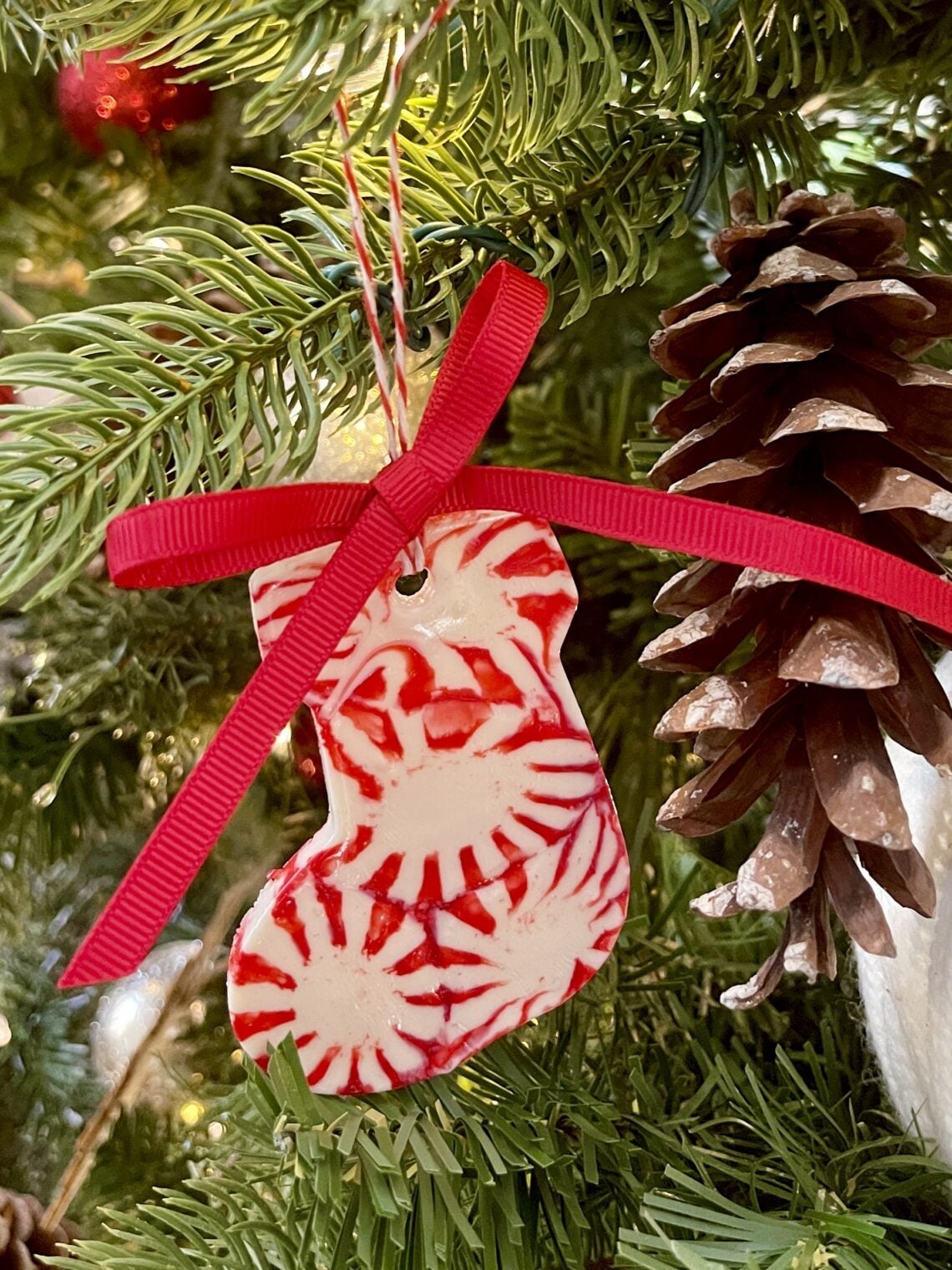
The red and white swirl on this stocking-shaped ornament mirrors the candy it is named after, but the scale is what makes it work. Wide bands of color read clearly from across the room, while the green ribbon and pinecone accent ground the festive palette. Polymer clay gives the pattern a clean edge that painted wood cannot match. The ribbon adds a soft contrast to the hard surface, and the natural daylight keeps the red from turning orange or brown.
14. Elegant Ivory Velvet Ribbon Flower Ornaments
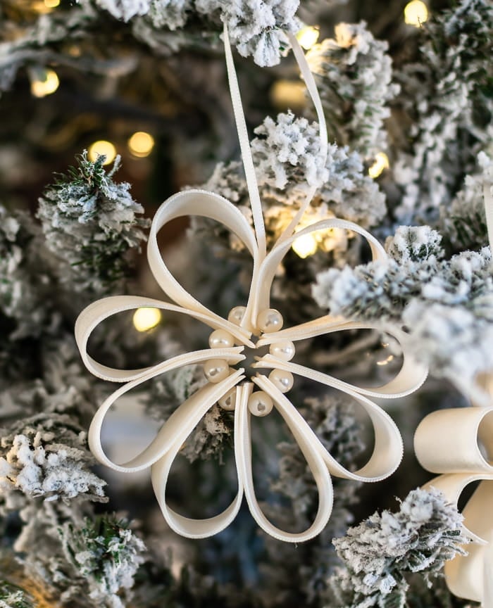
This ornament does not need color to hold its own. The ivory velvet ribbon flower is the only focal point, and the soft bokeh lights behind it keep the background from competing. The matte velvet absorbs light instead of reflecting it, which makes the metal hook and pearl accents stand out. The elegance comes from restraint: one flower, one material, one neutral shade. Adding a second ribbon or a brighter color would disrupt the look. Keep the palette monochrome and let the texture do the talking.
15. Glamorous Rhinestone Ornaments with Velvet Ribbons
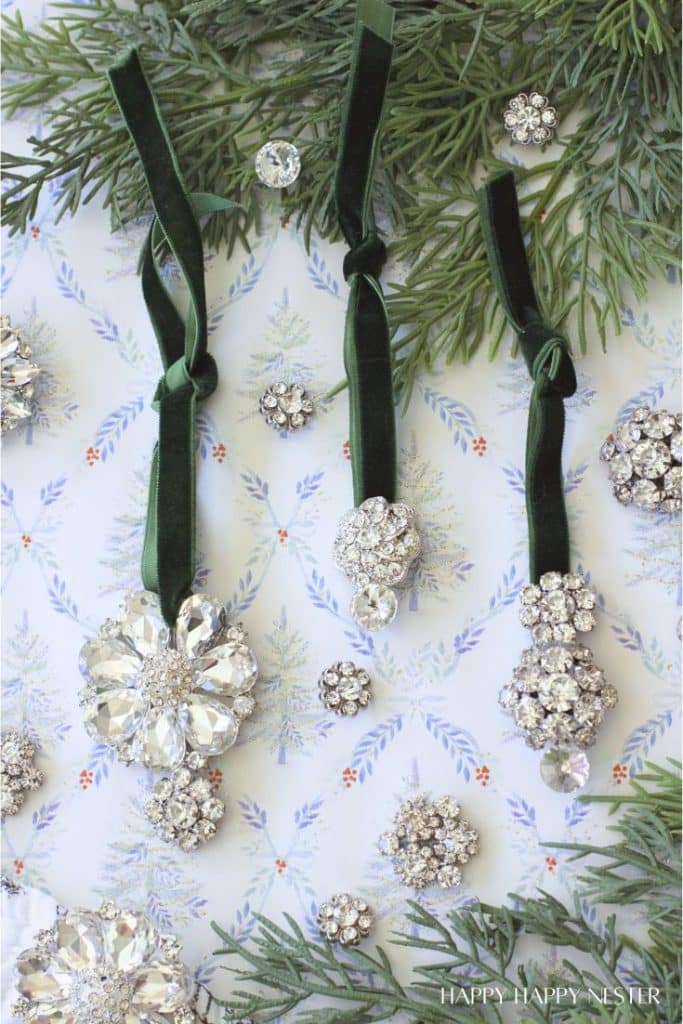
How do you store ornaments with delicate rhinestone embellishments without losing half the stones by next December? The answer is individual wrapping, not stacking. The flat lay in bright light shows how each jeweled ornament sits separately on greenery, which is exactly how they should be packed away: cushioned and spaced apart.
The glamorous vintage style relies on contrast between the clear rhinestones and the silver velvet ribbon. The greenery adds a natural element that keeps the sparkle from feeling cold. The palette is clean: clear, silver, and green. That ratio lets the rhinestones catch light without overwhelming the display. Skip the tissue paper and you will find loose stones at the bottom of the box next year.
16. Modern Ceramic Ornaments with Ribbed Textures
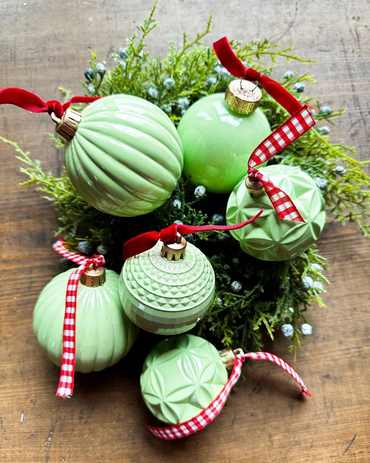
The smooth, ribbed texture of these ceramic ornaments makes them feel more like small sculptures than standard tree decor. In pastel green, red, and white, they bring a modern and minimalist look to the tree without relying on glitter or gloss. The vertical ridges catch natural daylight in a quiet way, adding depth to a simple palette. Arranged on a wooden surface with greenery, the set looks curated. This is a style where the material itself does the decorating, so keep other ornaments simple and let the ceramic finish carry the visual weight.
17. Floral Fabric Bow Ornaments for a Crafty Touch
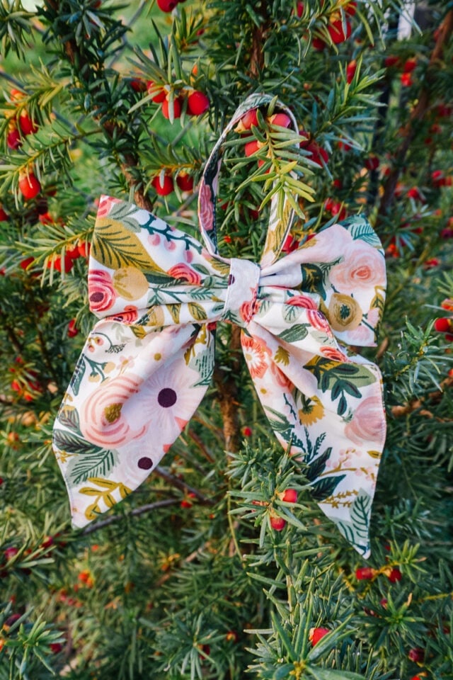
Match the scale of the bow to the branch it hangs on. This large floral fabric bow in pink, green, white, and gold works best on a sturdy branch or an outdoor tree where it has room to stand out. The soft, natural light lets the cotton fabric appear soft and inviting. The floral pattern defines the crafty, romantic style, and the gold thread breaks the sweetness just enough to keep it from feeling too precious. For renters, this is a zero-commitment swap that adds color and texture without altering the tree itself.
18. Botanical Simmer Pot Ornaments for Festive Fragrance
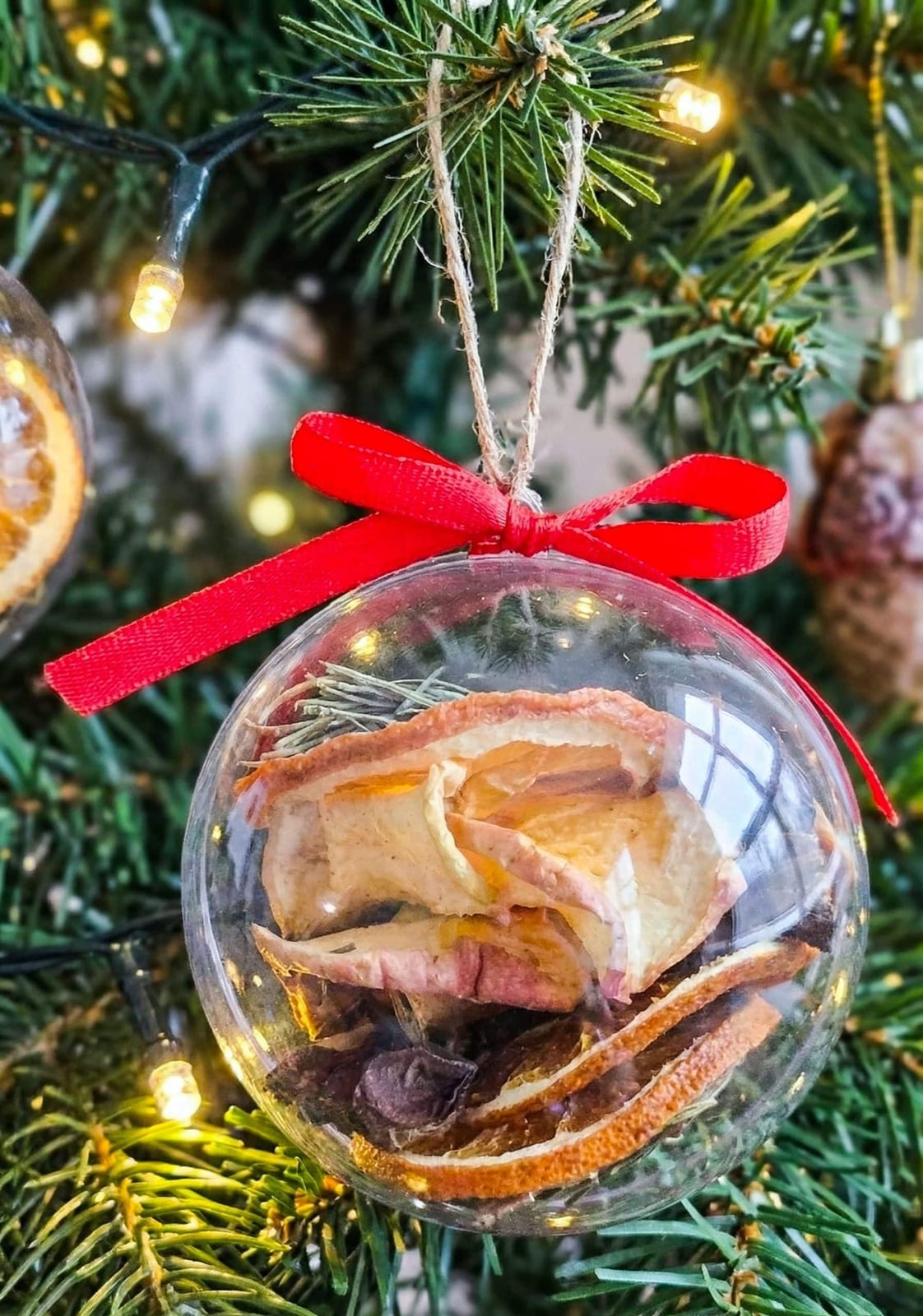
Unlike a standard glass bauble that only adds color, a simmer pot ornament brings scent into the mix. Inside a clear glass bauble, dried fruit and herbs create a warm, natural palette of red, green, and brown against the ambient glow of Christmas lights. The dried fruit and herbs do the decorating, so there is no need for paint or ribbon. The style is distinctly Christmas, but the natural elements keep it from feeling overly commercial. Hanging these among greenery and wood-toned decor reinforces the botanical theme. The key is to let the dried fruit and herbs stay visible, so the ornament looks like a tiny winter still life instead of a craft project.
19. Crafty Santa Gnome Ornaments with Fluffy Beards
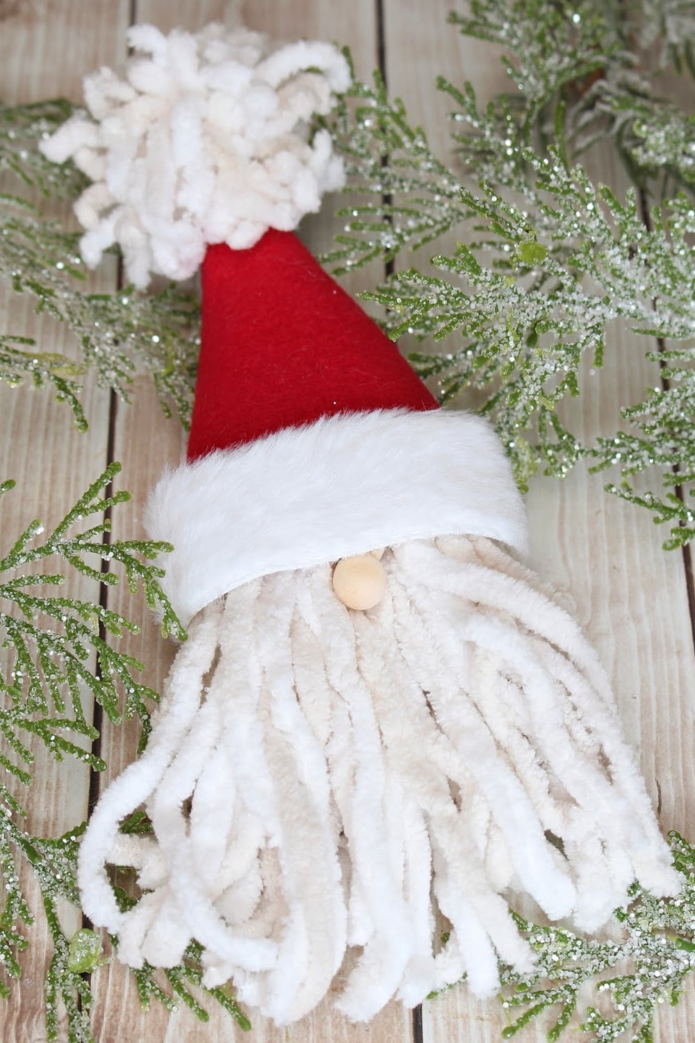
The fluffy beard and hat on this Santa gnome ornament give it a soft, tactile quality that standard felt ornaments lack. Made from felt, yarn, wood, and pine, the mix of materials adds visual interest without looking busy. The red, white, cream, and wood palette keeps the craft style grounded and avoids a toy-like feel. The natural, soft lighting helps the yarn beard read as fluffy rather than flat. For a tree that gets handled or bumped, this design holds up better than fragile glass, and the materials are easy to repair if something comes loose.
20. Vintage Embossed Tin Ornaments with Colorful Ribbons
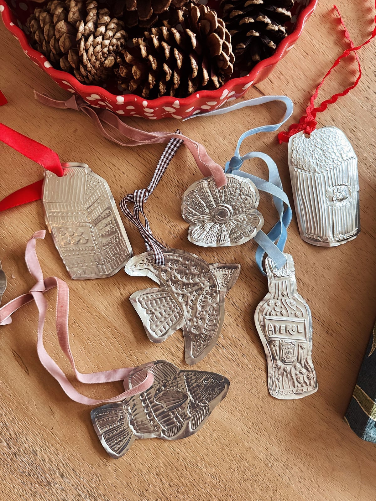
These embossed tin ornaments deliver maximum visual impact for their weight. The intricate embossed patterns in silver catch natural daylight from every angle, while velvet and gingham ribbons in red, pink, and blue add a soft contrast. The flat lay arrangement shows how the mix of shapes and ribbon colors creates a collected-over-time look. Pinecones anchor the palette with brown, keeping the silver from feeling cold. The vintage style reads as authentic because the embossed detail is dimensional, not printed. For scale, cluster smaller shapes together and let larger ones hang alone so each pattern gets noticed.
21. Final Thoughts
Making your own ornaments changes how you see the tree. Each one carries a small decision: the ribbon you chose, the pattern you pressed, the color you mixed. That is the real payoff. Not perfection, but presence. A few of these projects, like the salt dough and clay versions, hold up year after year if stored in a dry box away from direct heat. The paper and fabric ones are lighter and more fragile, so tuck them in tissue or hang them where they will not get bumped. If you want a cohesive tree, pick two or three techniques and repeat them across the batch. If you prefer a collected look, mix freely. Either way, you end up with a tree that tells a story only your hands could write.