Wrapping paper is the first thing anyone sees under the tree, so it carries a lot of weight for a few seconds of attention. This guide covers 21 Christmas wrapping paper looks, from burgundy and gold elegance to kraft paper with stickers, each with a clear style and practical notes on ribbon, tags and finish.
You will find ideas for matching paper to the gift, keeping a palette consistent and choosing textures that hold a crease. The aim is simple: pick a look you can repeat across a pile of parcels without the wrapping becoming a second job.
1. Elegant Burgundy and Gold Christmas Gift Wrapping

A deep burgundy paper paired with a gold ribbon shifts the holiday palette away from primary red toward something closer to claret. The cream and brown notes in the jute and natural fiber rug keep it grounded, while a few green Christmas tree branches add the seasonal cue without leaning on tartan or plaid. This is a palette that feels refined rather than loud, and it works because the ratio of dark to light stays weighted toward the richer tones. What breaks it would be too much gold. One ribbon per gift is enough.
2. Festive Christmas Wrapping Paper Showcase
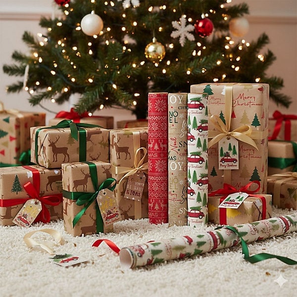
A floor display of wrapped gifts and paper rolls reads as abundant, but the layout keeps it from tipping into clutter. The Christmas tree anchors one side, while the rolls lean against the wall and the gifts cluster in the middle. That triangular arrangement creates a clear path: tree, gifts, paper. The warm tree lights tie the brown, green, red and white palette together, so nothing feels isolated. For renters who cannot rearrange furniture, shifting a display like this a few inches left or right can change how the whole corner reads.
3. Modern Festive Gift Wrapping with Illustrated Papers
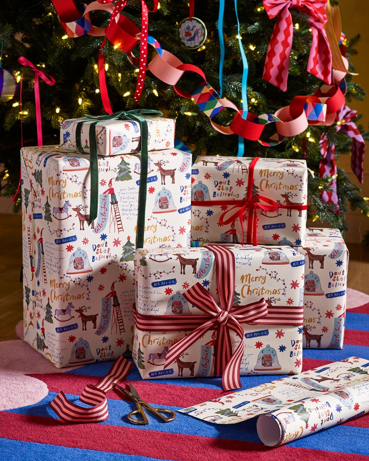
A mix of white, red, pink, blue and green can look chaotic, but illustrated motifs, trees, dots and stripes share a similar line weight, so they coordinate even when the colors clash on paper. The gifts stack around the tree base, with scissors and a paper roll nearby to suggest this is a working session, not a styled set. The festive string lights add warmth. If you rent and cannot change the wall color, this approach lets the paper do the decorating.
4. Vintage Botanical Deer Wrapping with Velvet Ribbon
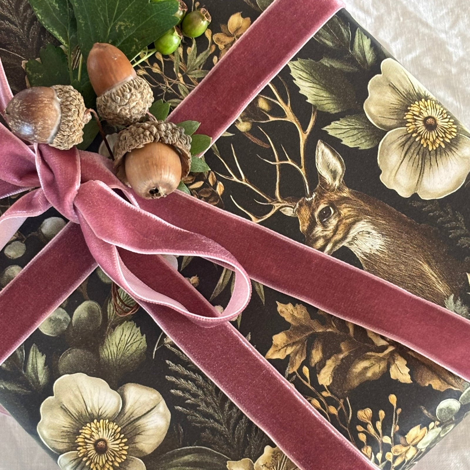
A pink velvet ribbon on dark, muted earth-tone paper is a materials lesson in contrast. The velvet naps catches the soft, dramatic light, while the matte paper absorbs it, creating a surface difference that reads as luxury without glitter. Acorns and leaves tucked into the bow add a natural element that echoes the deer and foliage print. For a renter-safe swap, use a wired ribbon that holds its shape so you skip the glue or tape on the gift itself.
5. Toile De Jouy Inspired Reindeer Forest Wrapping Paper
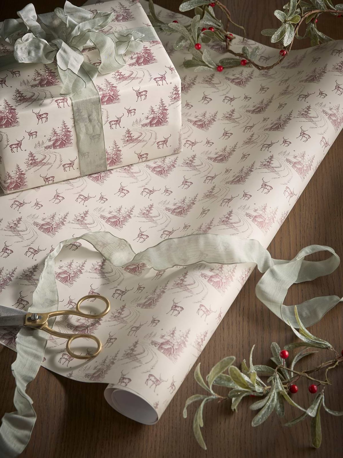
Store a paper with a repeating pattern rolled, not folded, so the design lines up cleanly at the seams. This cream and pinkish-red reindeer forest scene works because the scale of the motif is small enough to read on a gift but large enough to see from a distance. The soft natural light keeps the vintage feel intact, harsh overhead light would wash out the cream. A pair of scissors and a sprig of greenery on the wooden surface remind you that this is a working material, not just a decorative roll.
6. Traditional Botanical Christmas Paper Flat Lay
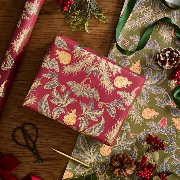
A flat lay of wrapping supplies has a different feel than a styled gift pile. Here the paper itself is the focus, not the finished box. Rolls of paper with an intricate botanical pattern sit alongside a pair of scissors and a pen, with pinecones and foliage adding a natural element. The palette stays red, green, and gold, which keeps the scene traditional. The flat lay layout lets you see the pattern repeat across the surface, which helps when you are deciding if a print works at scale. A useful decor principle for this arrangement is layout: when you lay supplies flat, group by color first, then by material. That keeps the composition readable rather than busy. The ribbon and natural accents break up the repeat of the paper pattern and add texture without competing with the botanical print.
7. Blue and Gold Christmas Gifts Under the Tree
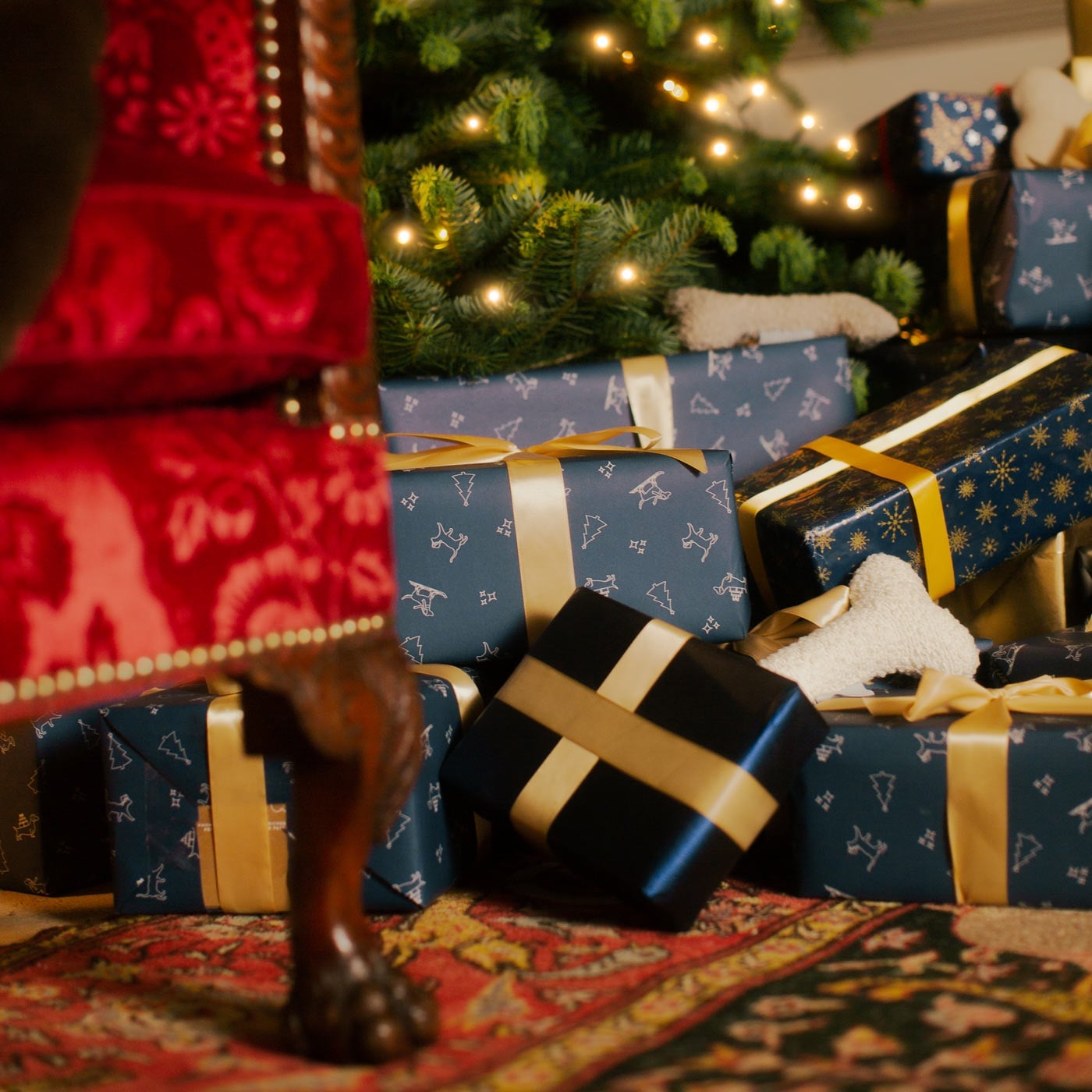
A pile of gifts under a Christmas tree shifts the palette from the usual red and green to blue and gold, with red and green still present in smaller amounts. The wrapped boxes sit near an armchair, with tree lights adding a warm ambient glow. The palette works because the blue acts as a neutral ground for the metallic gold, which catches the light from the tree. A useful decor principle for this arrangement is palette: when you bring in a non-traditional color like blue, keep the metallic accents consistent. Gold ribbon and paper tie the cool blue back to the warm tree lights, so the pile reads as intentional rather than random.
8. Twelve Days of Christmas Themed Gift Wrapping
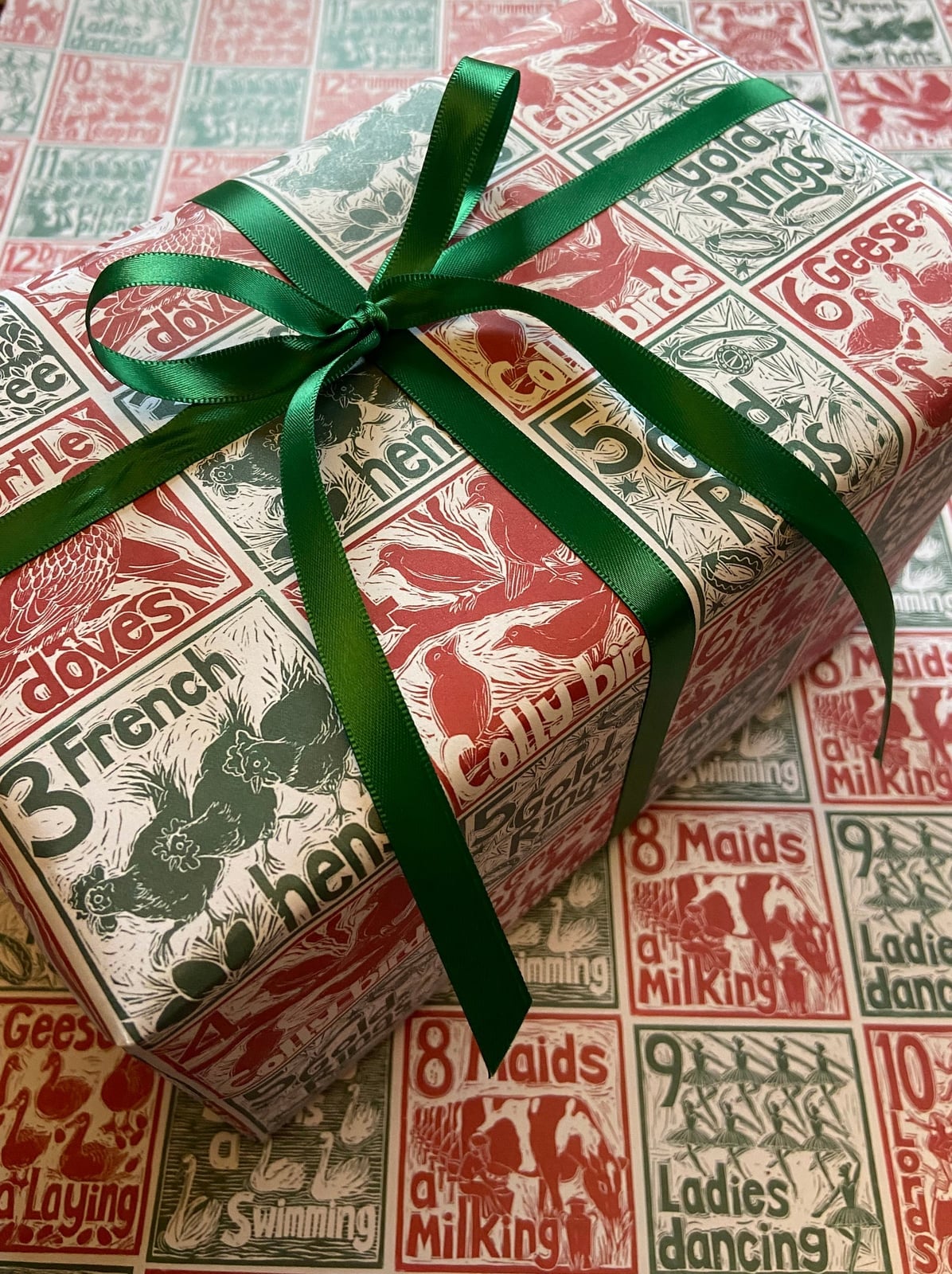
This paper works best for a single gift meant to stand out. The twelve days of Christmas pattern repeats across the paper in red, green, and white, with a ribbon tied around the box. The pattern is detailed enough that a simple bow is all the trim it needs. When the paper has a busy narrative print, keep the ribbon plain and the bow small. That way the illustration stays readable and the gift does not look overcrowded. The white background in the paper helps the pattern breathe, so the gift looks festive without feeling cluttered.
9. Whimsical Santa Sleigh Night Sky Wrapping Paper
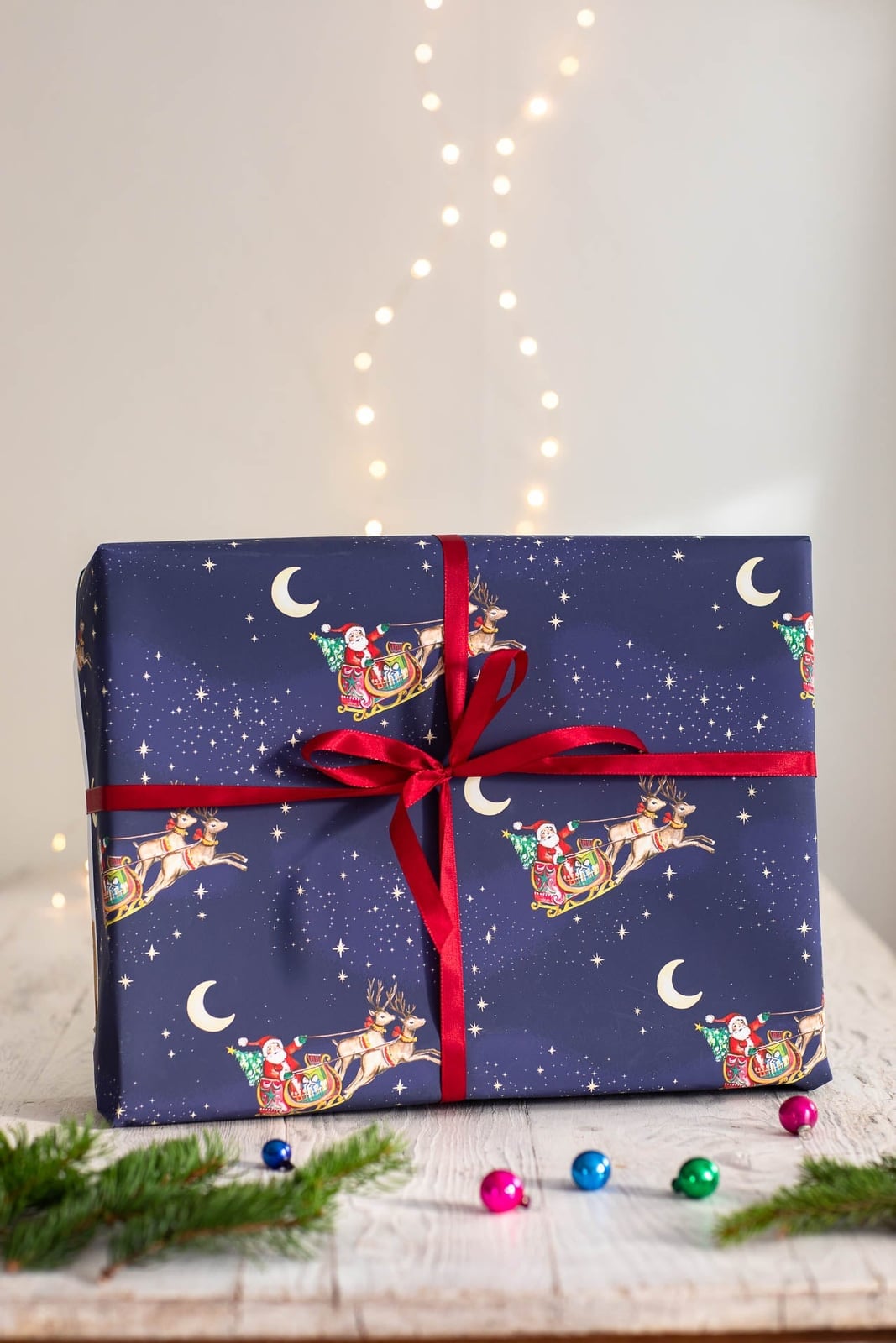
Does a whimsical print still feel appropriate for a grown-up gift exchange? It can, if the colors are deep enough to ground the illustration. This paper uses a navy background with red, white, and gold accents for the Santa in a sleigh design. The dark base keeps the look from feeling too juvenile, while the sleigh illustration adds a storybook quality. A whimsical pattern works best when the background is a dark or muted tone. The gold accents in the print catch the soft ambient light and give the paper a subtle shimmer. The bokeh background in the setting reinforces the night sky feel.
10. Natural Kraft and Textured Paper Gift Wrapping

Kraft paper, twine, and paper stars make up this natural rustic wrapping setup. The palette stays brown, green, cream, and gold, with the brown kraft paper acting as the base for everything else. Rolls of paper sit alongside wrapped gifts and star decorations, with scissors nearby. When you use kraft paper, the texture of the ribbon and the shape of the toppers matter more than the print. Twine and paper stars add dimension without needing a pattern. The cream and gold accents keep the natural brown from feeling too plain, and the mix of textures gives the flat lay depth.
11. Classic Red and Green Tartan Christmas Wrapping
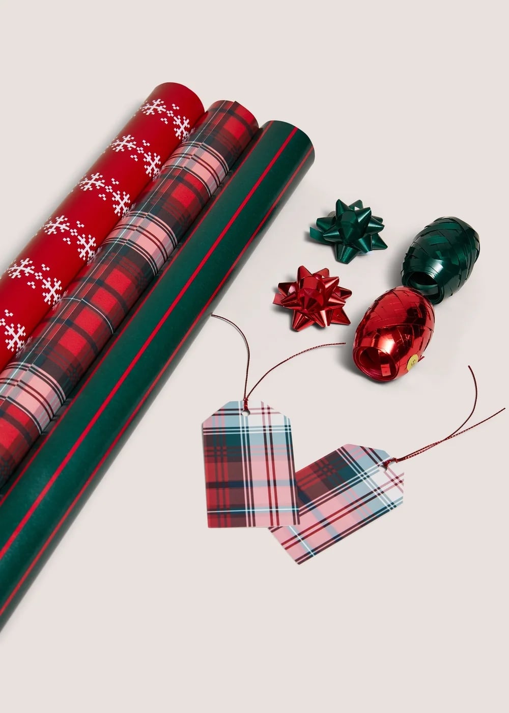
A classic plaid palette reads as festive without a single Santa in sight. Red, green, white, and pink tartans layer together on a light surface, with matching gift tags and bows tying the look closed. The style holds because the ratio of pattern to solid stays balanced: one plaid roll next to another, never three competing stripes in a row. What breaks it is a stray non-plaid print, so commit to the tartan family or leave one roll out.
12. Rustic Holly and Berry Kraft Paper Gifts
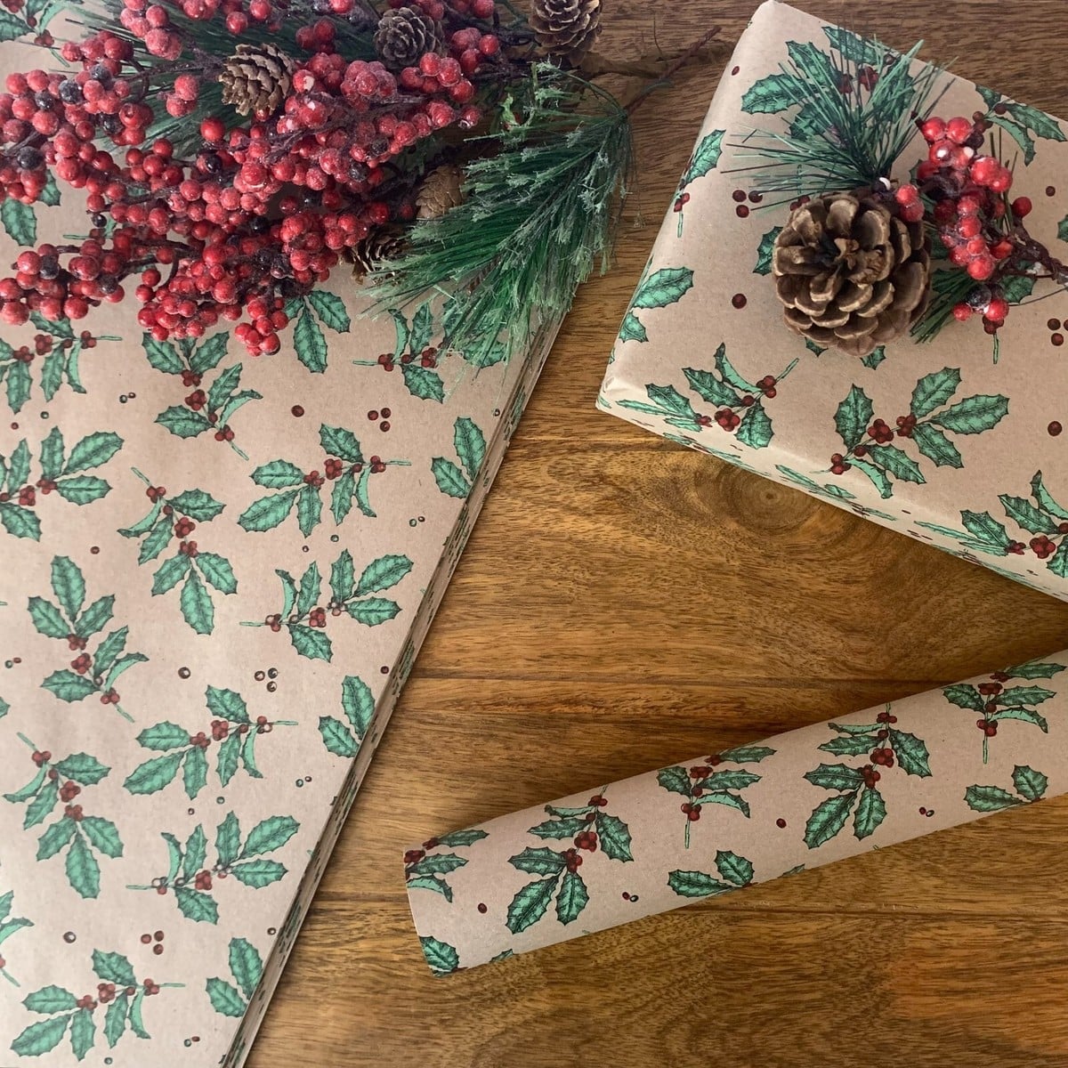
Kraft paper gifts lean woodsy rather than polished, so the holly and berry trim does the work. Brown paper wraps each box, with pine sprigs, red berries, and a pinecone tucked on top and set against a wooden surface. Natural daylight keeps the greens true and the reds from reading orange.
The rustic look depends on texture more than color. Matte paper, rough pine needles, and a bare wood table create a tactile moment that glossy ribbon would undo. If the gifts sit under a tree, match the pinecone to the same species as the tree for an intentional finish.
13. Whimsical Gingerbread Man Patterned Gifts
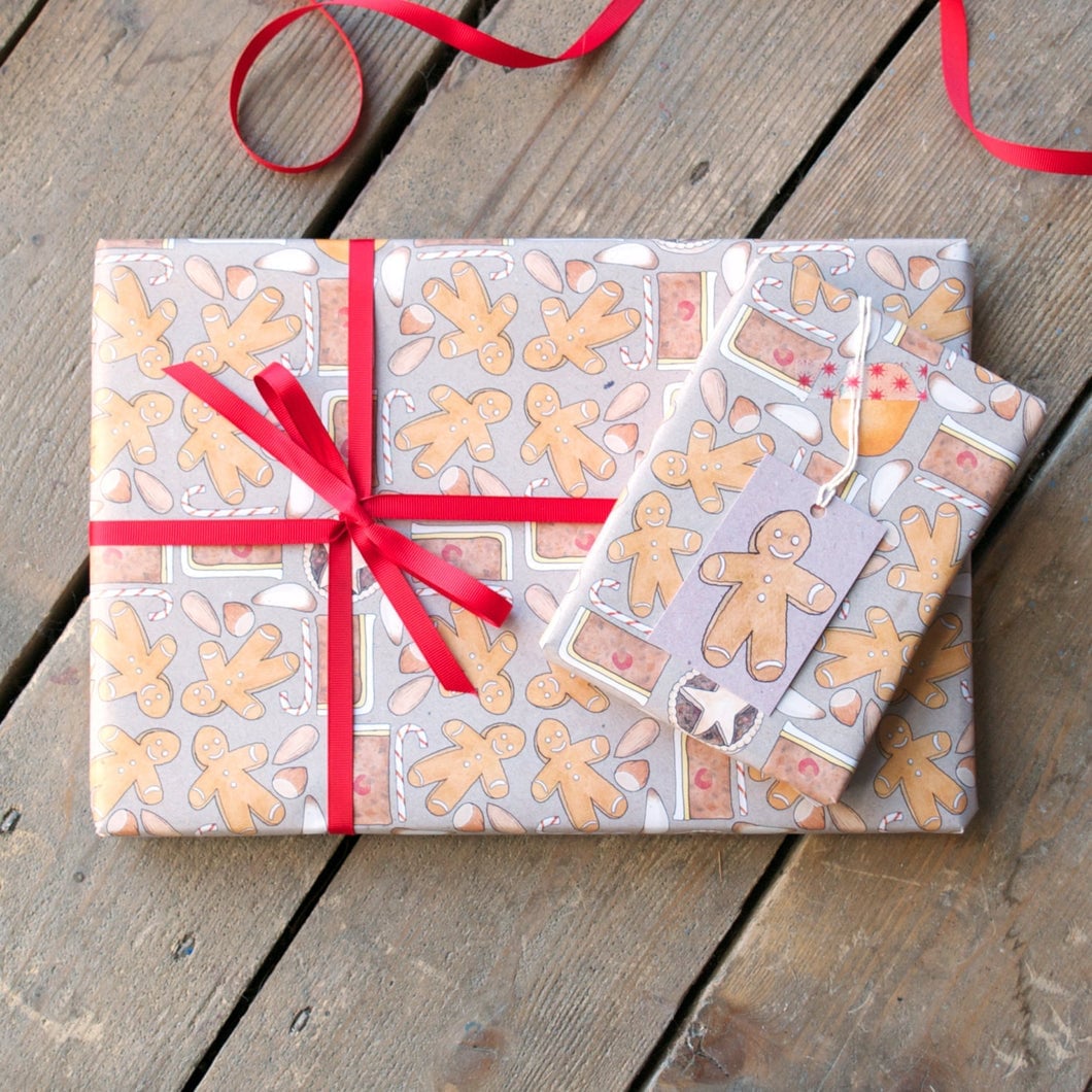
A gingerbread man pattern shifts the tone from formal to playful. Grey, orange, and red repeat across the paper, with a ribbon and tag resting on a wooden surface. The whimsical style works because the pattern stays small and evenly spaced, which keeps the gift shape readable. A solid ribbon in one of the print colors stops the wrap from feeling busy.
14. Variety of Festive Patterned Wrapping Paper Rolls
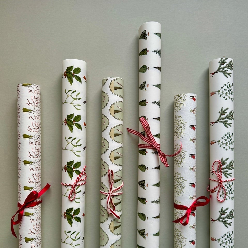
Seven rolls of wrapping paper lined up vertically make a strong visual inventory. White, green, and red patterns range from stripes to dots to trees, all held together by soft even light that keeps the colors crisp. The layout works for a gift-wrapping station: arrange rolls by color family so you grab the right one without unrolling each tube. A narrow shelf or a shallow bin keeps them upright and visible.
15. Traditional Quilt Star Pattern Wrapping Paper
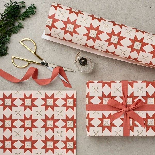
How do you make a single wrapped gift hold its own under the tree? A quilt-like star pattern in red, cream, and green does the job. The overhead flat lay shows a wrapped box, a roll of matching paper, and scissors, with a small sprig adding a natural note. Soft studio light flattens shadows so the geometric star reads clearly. The style is traditional, but the repeating star breaks the expected stripe or plaid, giving it a handmade feel without the work of actual quilting.
16. Modern Gold Christmas Tree Patterned Gifts

Cream paper printed with a gold tree pattern feels fresh because it skips every red and green cliche. The palette stays tight: cream, gold, brown. A white ribbon and a sprig of greenery are all the contrast the arrangement needs. Style mode means one strong look runs the show, here the gold tree is it, and everything else steps back. What breaks the look is adding a second pattern or a bright bow. Keep the trim neutral and the paper does the work.
17. Minimalist Kraft Paper with Christmas Stickers

A practical rule for paper that works with any gift shape is to choose a material that bends without tearing. Kraft paper does that well, and its brown surface takes a sticker without slipping. A single red ribbon and a few Christmas stickers keep the wrap simple. The texture of the kraft paper is the hero here, so let it show. For renters who cannot change wall color or cabinets, this kind of wrap brings the same calm to a gift pile. Stick to one or two sticker designs so the paper still reads clearly.
18. Modern Mistletoe and Wreath Wrapping Paper
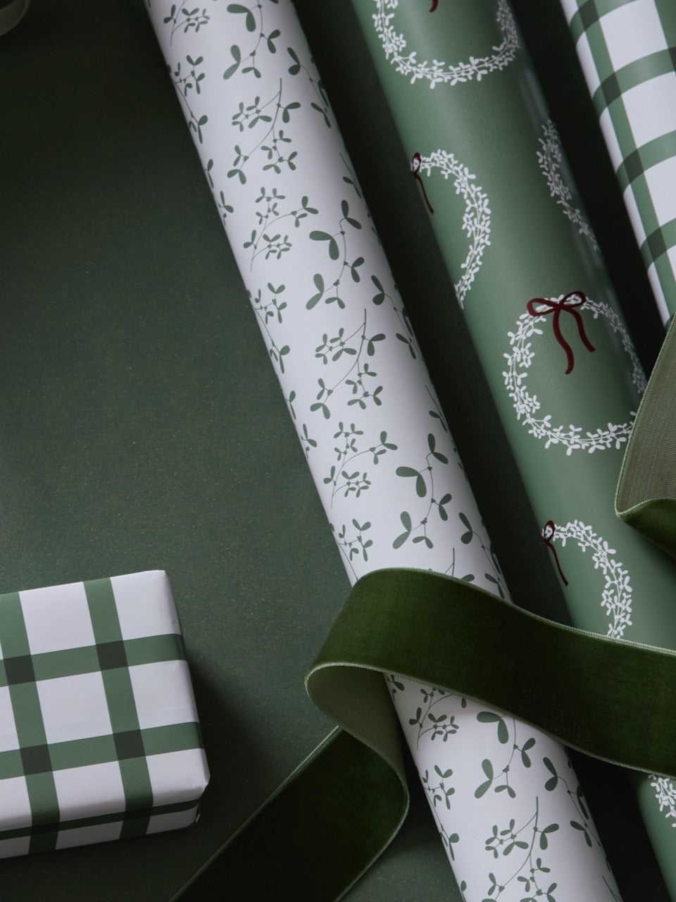
Where a traditional Christmas wrap piles on red, green, and gold, this one works in just green and white. The mistletoe pattern repeats in a clean line across the paper, and the white background keeps the whole thing from feeling busy. A small gift wrapped in the same paper ties the group together.
Palette mode means the color ratio matters. Here green holds about sixty percent of the visual weight, white the rest. Adding a third color like red or blue disrupts the balance. Stick to a natural ribbon or twine, and the paper stays the star. For a quick swap, use a white gift tag instead of a colored one.
19. Graphic Bauble Patterned Christmas Wrapping
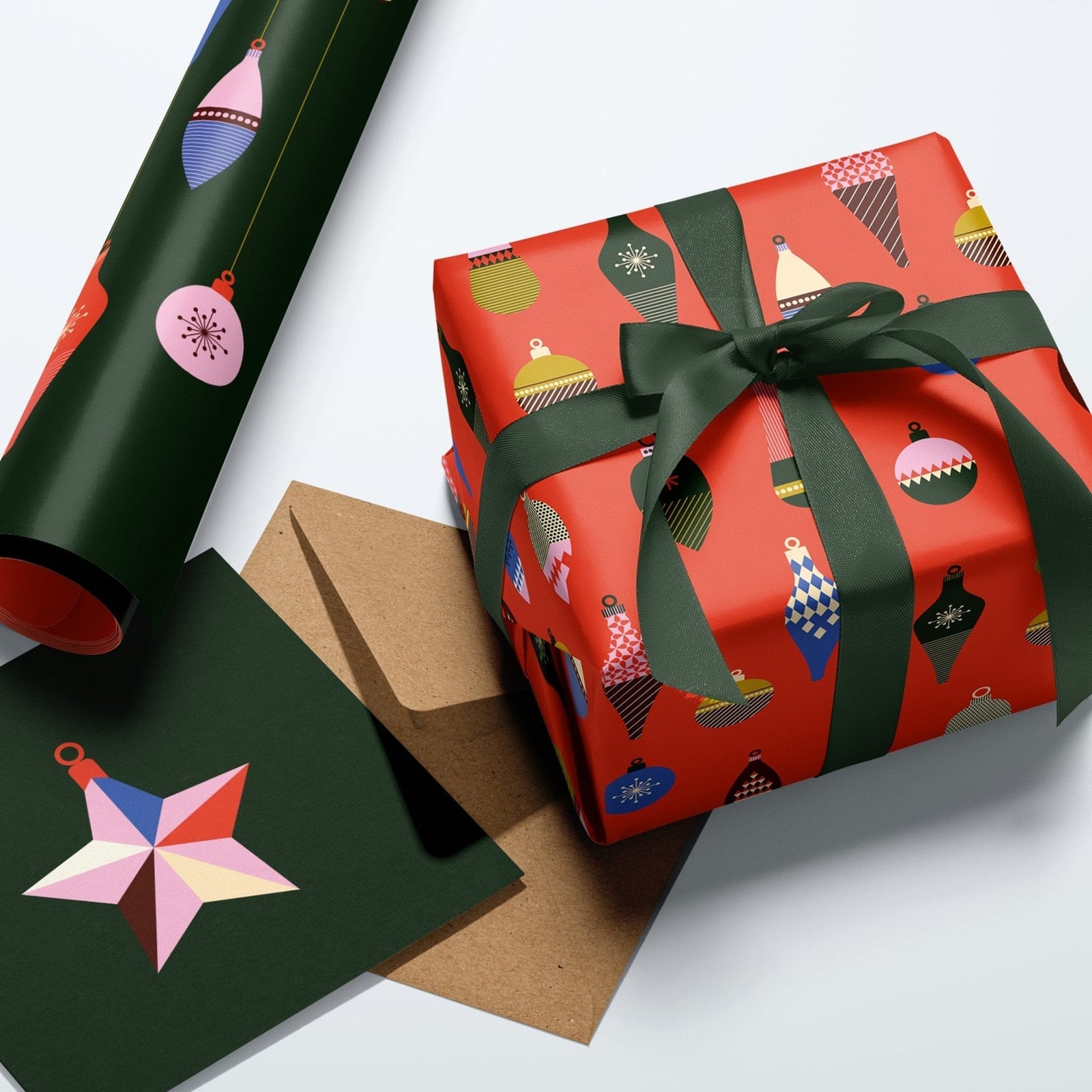
The bauble pattern runs in a clean repeat across red paper, with teal, pink, and yellow ornaments scattered through it. Style mode puts that graphic repeat at the center. The wrap includes a white ribbon and a plain envelope, keeping it simple. Avoid adding a second busy pattern or a metallic ribbon that competes with the bauble colors. The paper already has twenty-one colors in play, so let the ribbon be one solid shade from inside the design.
20. Traditional Robin and Berry Wrapping Paper
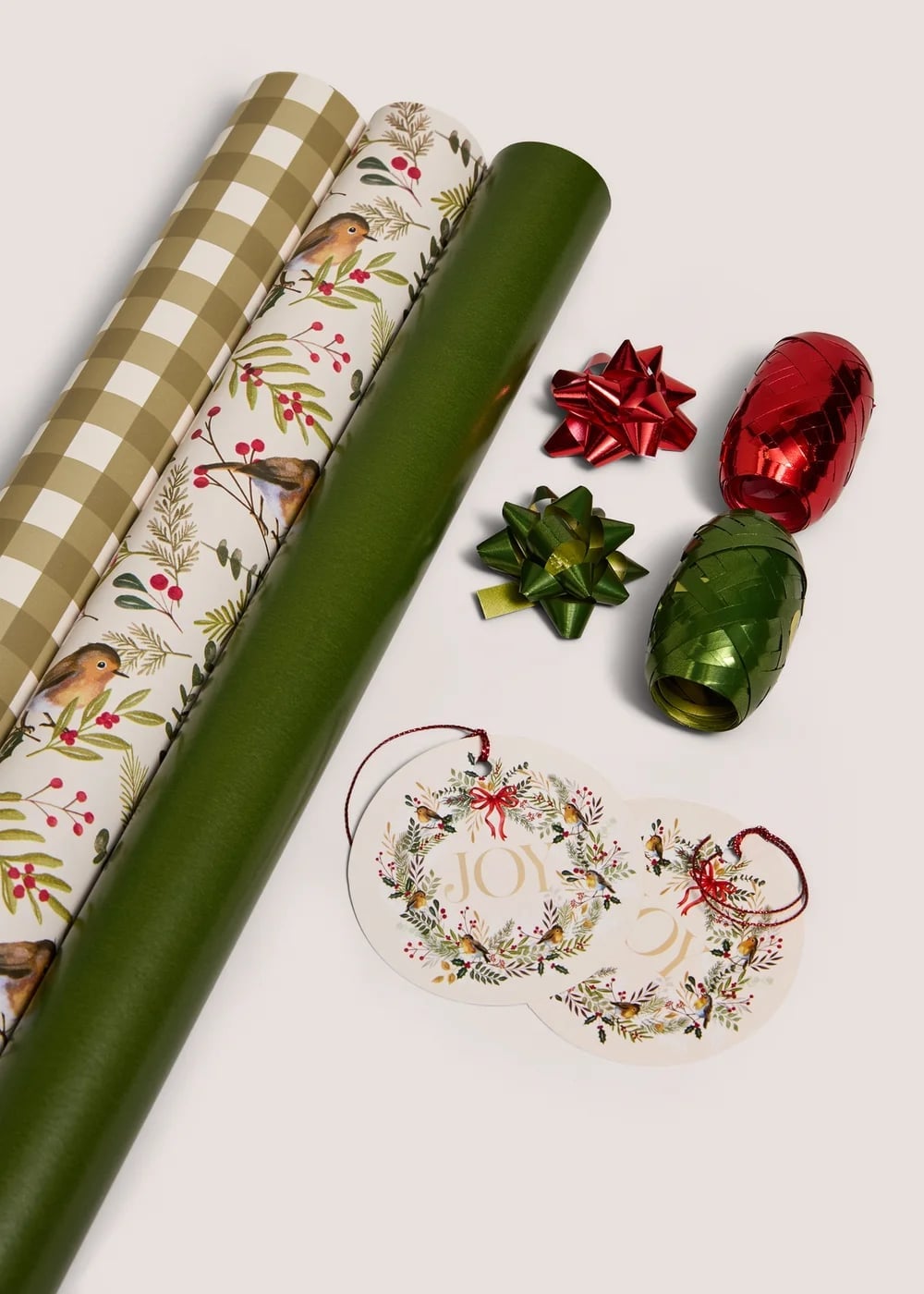
This paper lands squarely in traditional territory, with a robin and berry pattern printed on a beige ground and a green paper roll next to it for contrast. Materials mode puts paper first: the matte finish of the robin roll and the slight foil accent on the berries give it enough texture without glitter. A red gift bow and a tag complete the flat lay. Mixing in a modern geometric wrap or a glossy ribbon disrupts the classic feel. Keep the trim classic, velvet or grosgrain, and the paper pattern reads clearly.
21. Modern Navy Star Patterned Gift Wrap
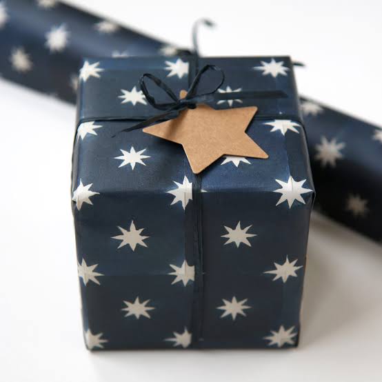
What makes a navy blue gift feel festive without tipping into literal holiday cliches? This wrap goes for a deep, inky navy base scattered with white stars. The contrast is crisp and the pattern is graphic rather than cutesy, so the whole look stays clean and grown-up. A brown kraft gift tag and natural ribbon keep the palette grounded, adding a warm, tactile pause against all that cool blue and white.
The stars are small and evenly spaced, which gives the paper the feel of a repeating textile print. That kind of allover pattern works well when you keep wrapping simple. No bows, no layered ribbons, just one clean stripe of ribbon and a tag. The navy provides the dominant color. What breaks the monochrome is that single brown note, and it is enough to keep the gift from feeling flat or too nautical.
22. Final Thoughts
Wrapping paper is the first thing a gift says, so let it say something. Across these 21 ideas, the strongest looks repeat a few habits: pick one palette and stay in it, keep ribbons and tags in proportion to the box, and choose a paper weight that folds sharply instead of fighting back. Pattern does the talking, so trim, tag, and greenery can stay quiet. Store rolls upright and away from heat and they will hold their color until next winter. Wrap a few gifts tonight, stack them where you will see them, and let the paper do the decorating before the tree is even finished.